Independent magazine: REWIND
Editorial Design

Student project
2026
OVERVIEW
This project involved creating a finished proposal for an independent magazine, including a distinctive visual identity and series of cover designs. The publication features a range of editorial content, including feature articles, interviews, listings, and shorter pieces, all brought together through a cohesive design system.
Challenge
I chose to focus on nostalgia, a feeling that connects people to memories and past experiences. The main challenge was translating this intangible emotion into a contemporary magazine that felt engaging without appearing dated.
Solution
I created, an independent magazine exploring how past trends shape contemporary culture. The “Retro” issue features film photography, vinyl, retro fashion, and design. Retro elements informed the visual language, while typography and layout kept it feeling contemporary.
RESEARCH
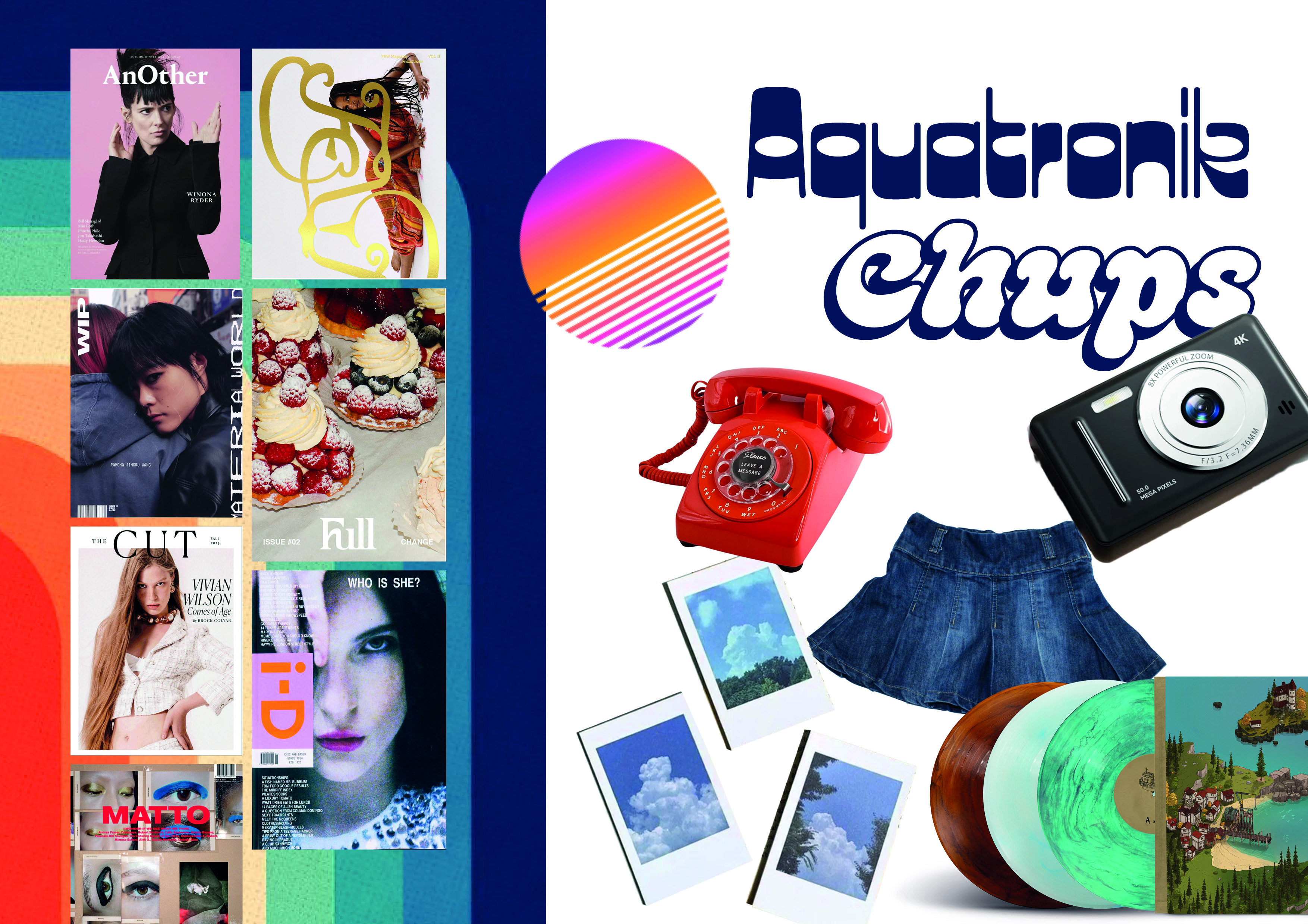
I began my research by creating a visual moodboard to explore the magazine’s aesthetic, combining independent magazines, nostalgic colours, retro objects, and typography. This helped define the look and feel of REWIND and informed my design decisions, ensuring a consistent visual language rooted in nostalgia.
DESIGN
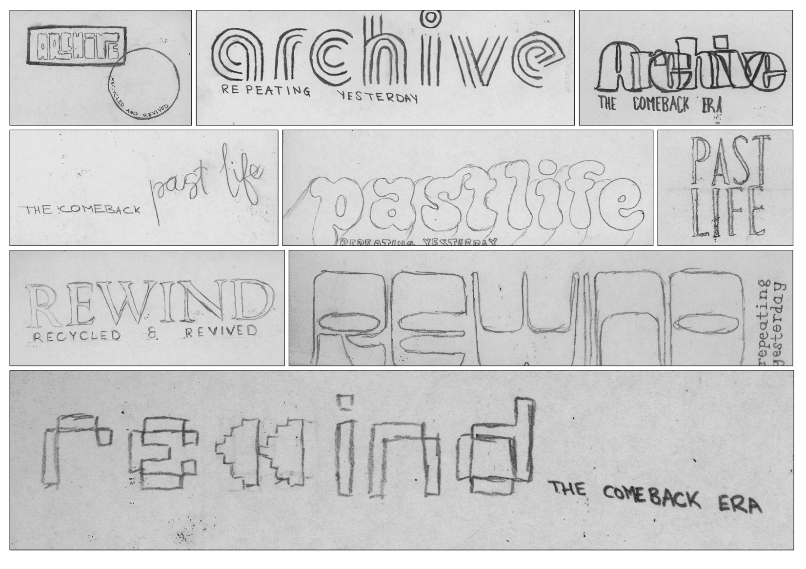
I explored name and masthead concepts, narrowing it down to three options:
Archive
Pastlife
Rewind
Drawing on retro magazines and nostalgic typography, I experimented with bold serifs, condensed sans serifs, overlapping letterforms, and pixel-based type.
The final masthead, REWIND, uses a rewind icon in the “w” and the tagline “repeating yesterday,” balancing nostalgia with a contemporary feel.
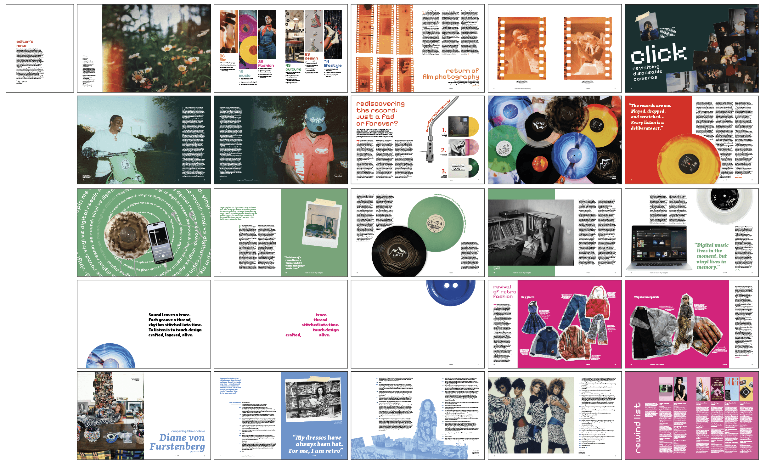
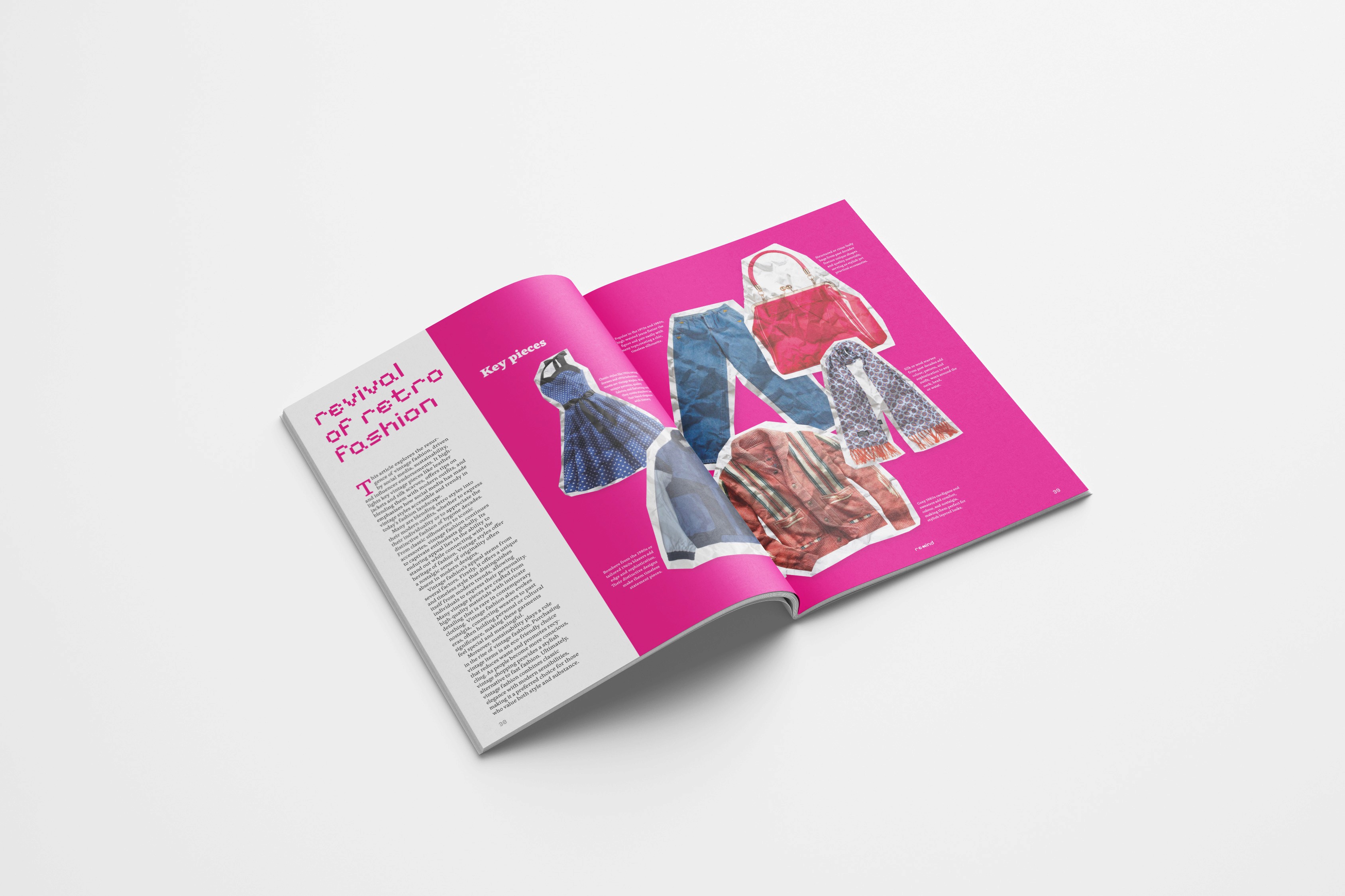
I explored cover concepts inspired by vinyl records, Polaroids, and the rewind icon before selecting the Polaroid idea as the final direction. I aimed to make the magazine feel tactile, using details like a sticker Polaroid and foiled masthead to create a recognisable cover.
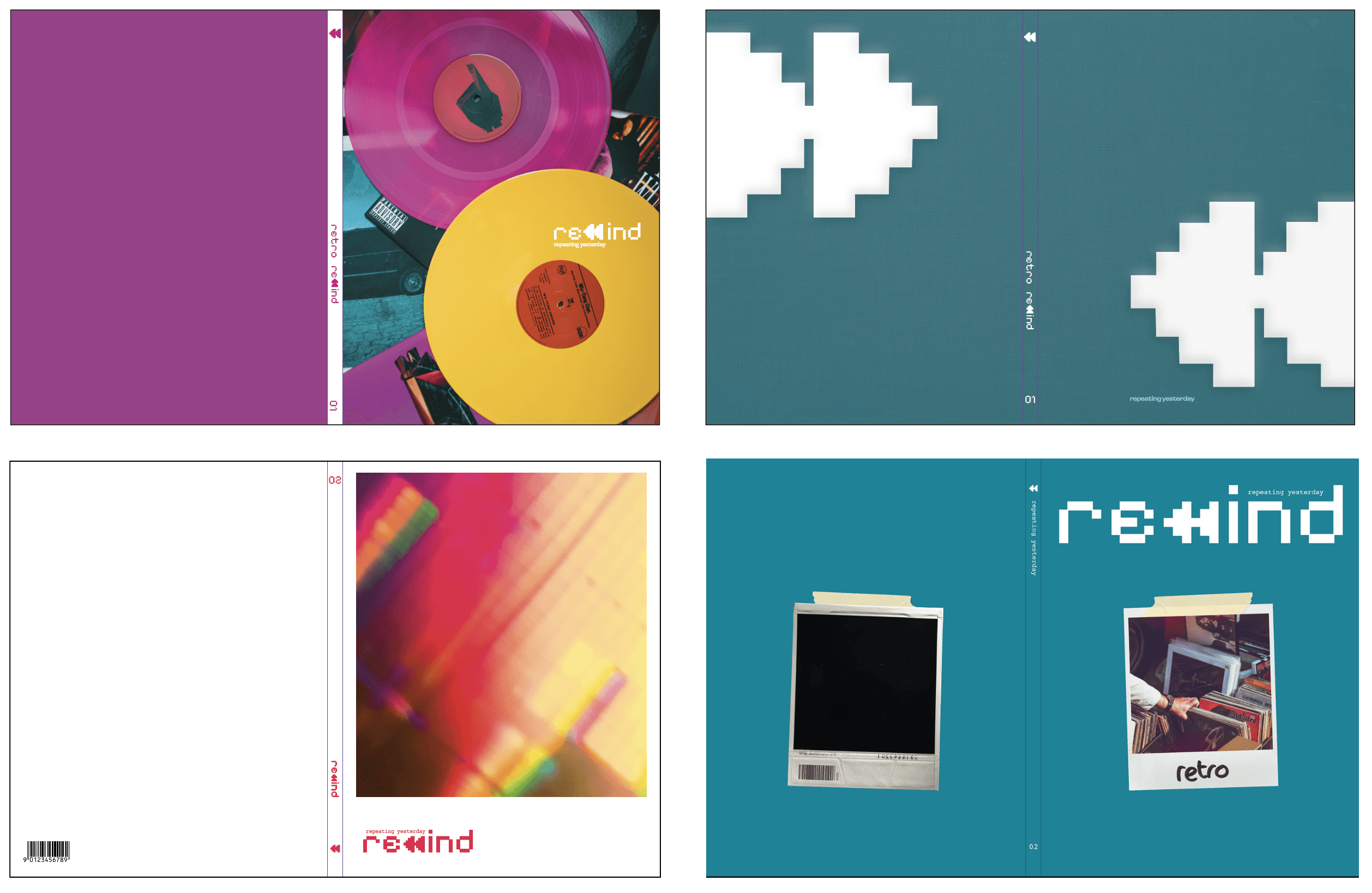
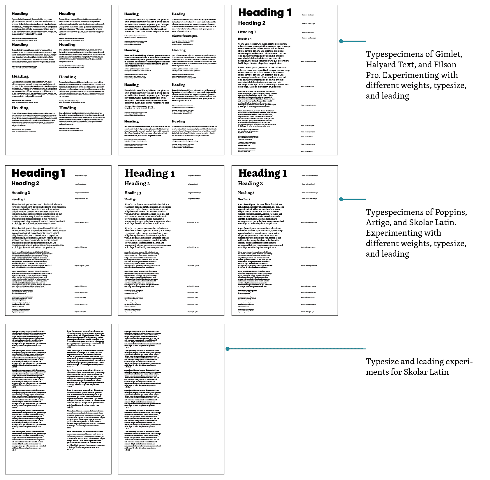
Typography became central to the magazine’s identity. After testing various serif and sans serif options, I chose Skolar as the primary typeface for its legibility and versatility as a superfamily.
These design decisions together shaped the magazine, the final outcome captures the emotions of nostalgia while presenting it through this editorial perspective.