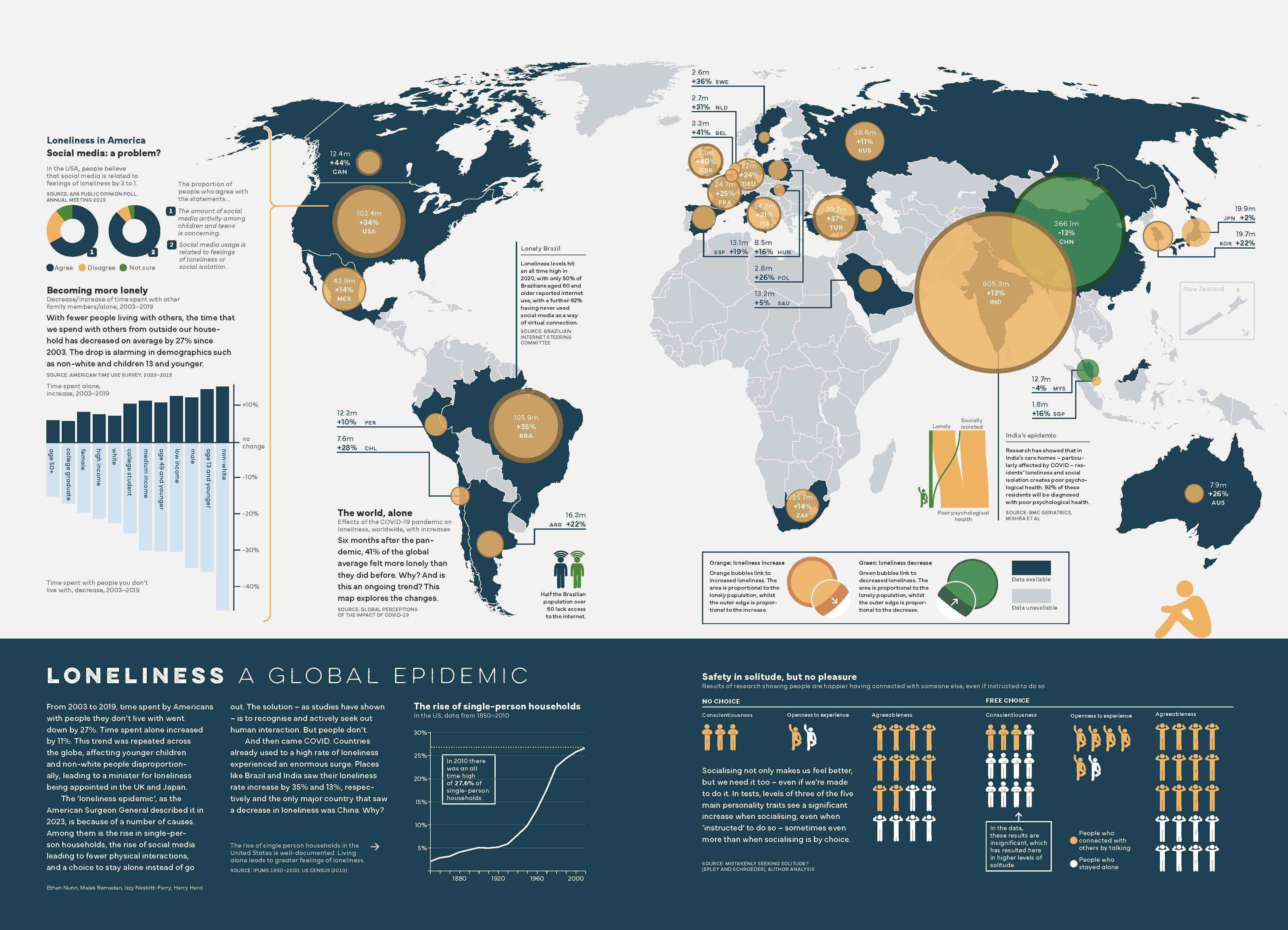
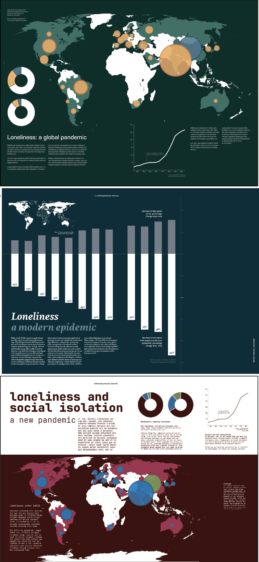
Loneliness a global epidemic
Information design

CLIENT: Student Project
2025
OVERVIEW
This project involved designing a magazine spread to raise awareness of social issues through infographic-led design and clear data communication. Working in a group, we created a double-page spread supported by animated social media assets, focusing on loneliness and social isolation to turn complex data into an engaging visual narrative for a broad audience.
Challenge
Working with quantitative data made it difficult to create clear, impactful visuals, as numbers can be overwhelming and hard to interpret. We had to select and organise suitable datasets on loneliness and social isolation, then translate them into accessible visuals across the group. We narrowed this to six key datasets and tested different visual approaches to ensure clarity, accessibility, and a sense of hope rather than negativity.
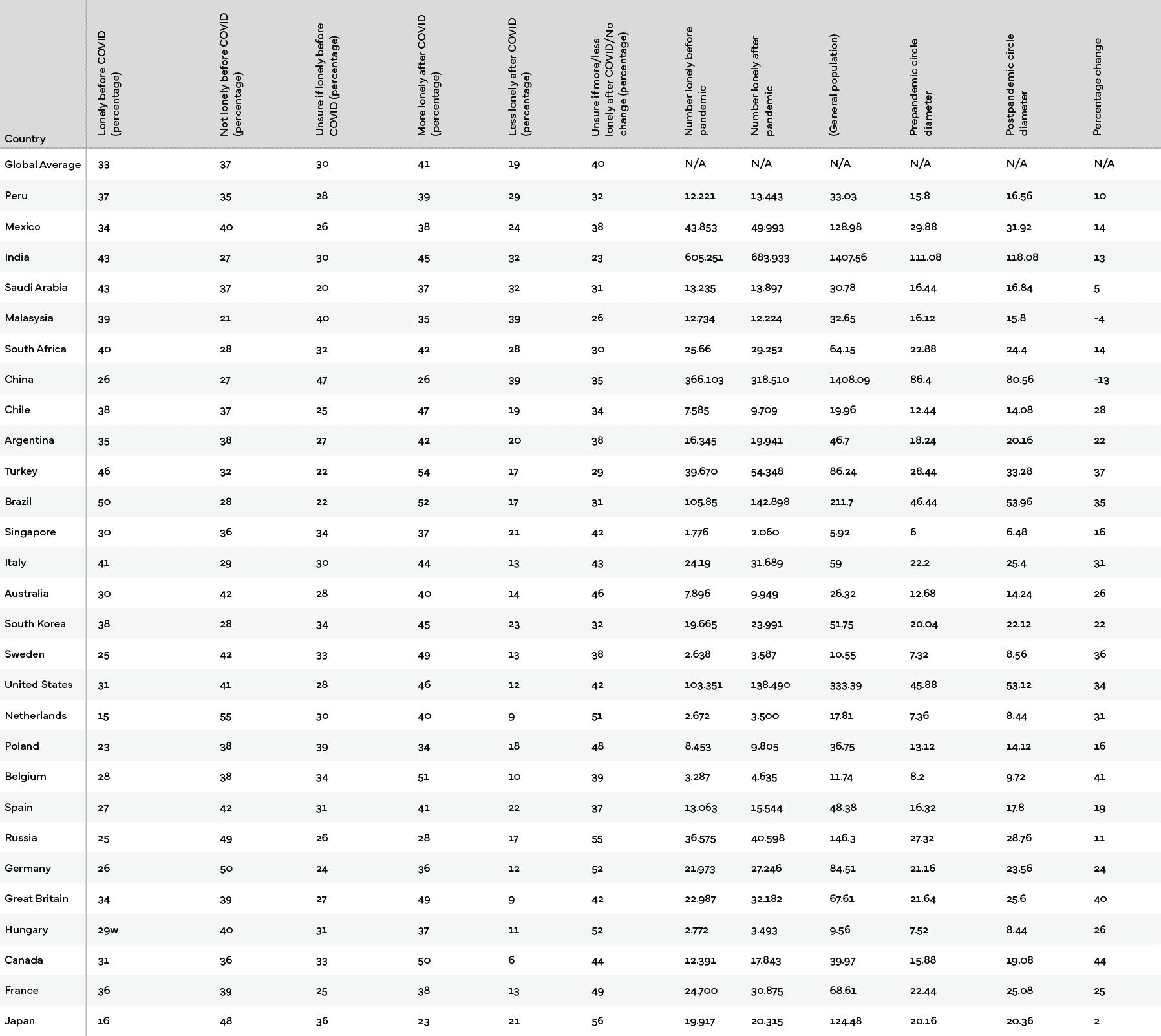
We began by selecting datasets that were both visually and emotionally effective, prioritising those that clearly showed patterns and change over time.
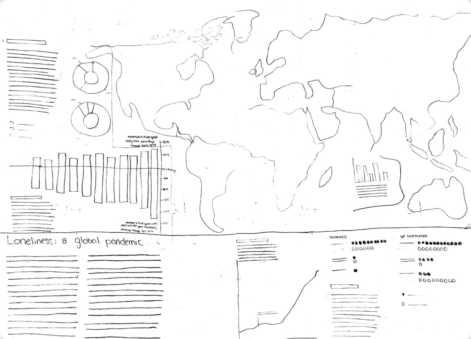
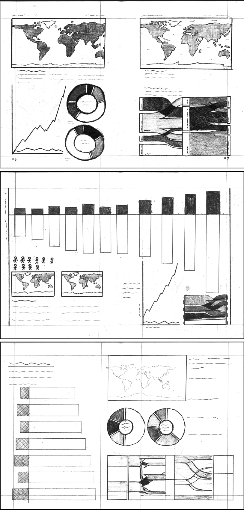
Through sketching and experimentation, we explored different visual systems including maps, pictograms, and line graphs to determine the most effective way to communicate each dataset. Visual hierarchy and scale were used to guide the reader through the information.
RESEARCH
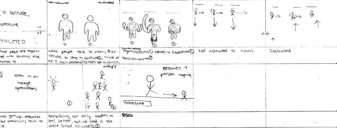
For the animation deliverable, each member animated a different graph. I focused on the pictogram, starting with a storyboard to plan movement and pacing. I then developed the animation in After Effects, refining timing and flow to keep it engaging while remaining clear and easy to follow.
The next step was to digitise our sketches and test how they would work at scale. We translated the graphs into three concepts to explore how they interacted within the layout, allowing us to refine the design before finalising the infographic.
DESIGN
We combined the strongest elements from our three concepts to develop the final infographic, carefully evaluating each layout to identify the most effective way to communicate the message. The map was selected as the hero graphic for its immediate impact and ability to convey global scale, while colour and typography were refined to ensure consistency and emotional alignment with the theme of loneliness.
As the static design developed, the animation progressed in parallel. After creating a storyboard, I moved into After Effects to build the sequence frame by frame, refining timing and flow as needed to ensure smooth motion within the time limit.