Guild of St. Geroge rebrand
Branding

Student project
2026
OVERVIEW
This project rebranded the Guild of St. George to create a contemporary identity that reflects its heritage while improving clarity and accessibility. It repositioned the organisation within the arts and heritage sector and developed a refreshed visual language across digital and physical applications to strengthen engagement and recognition.
Challenge
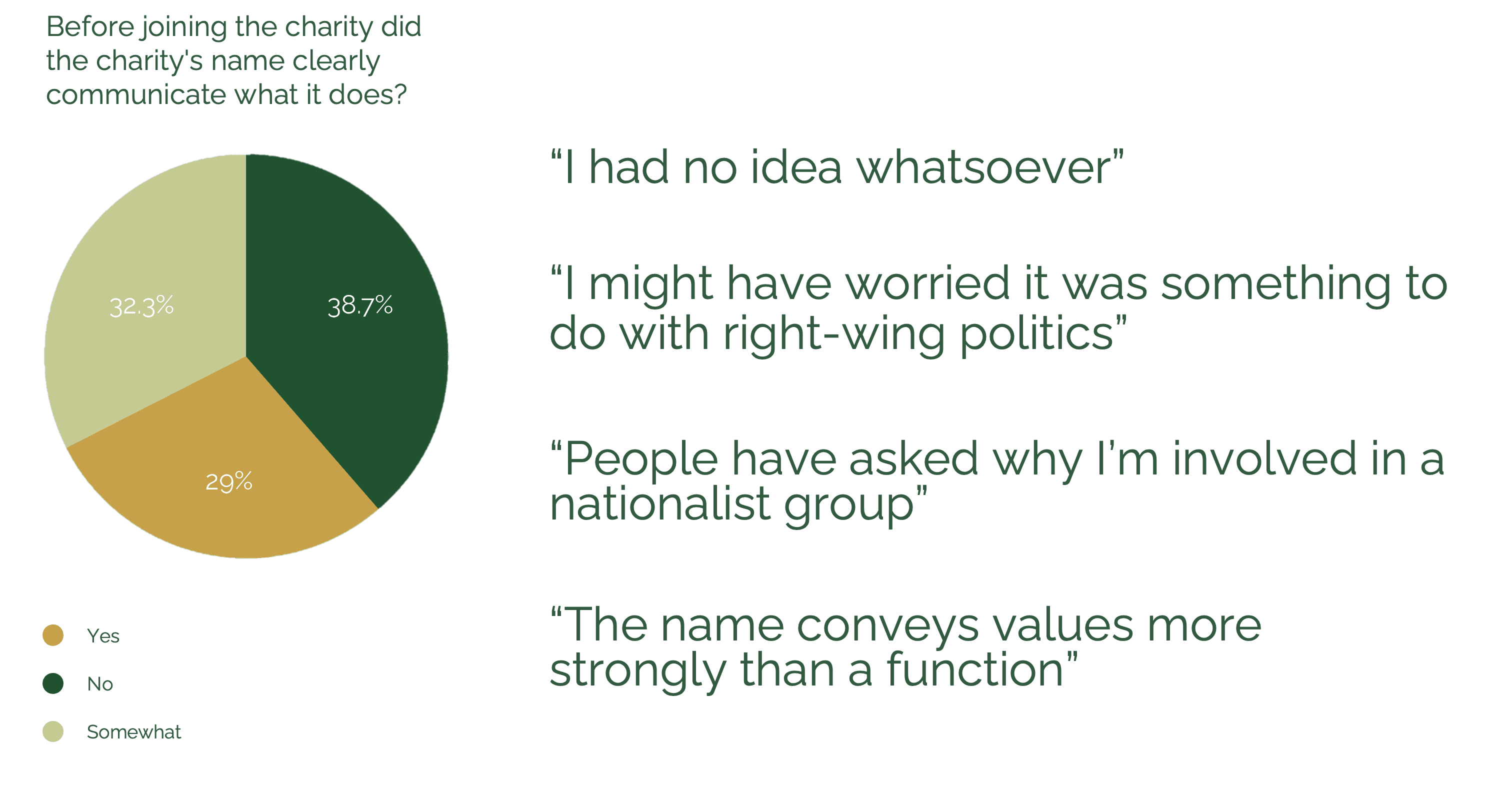
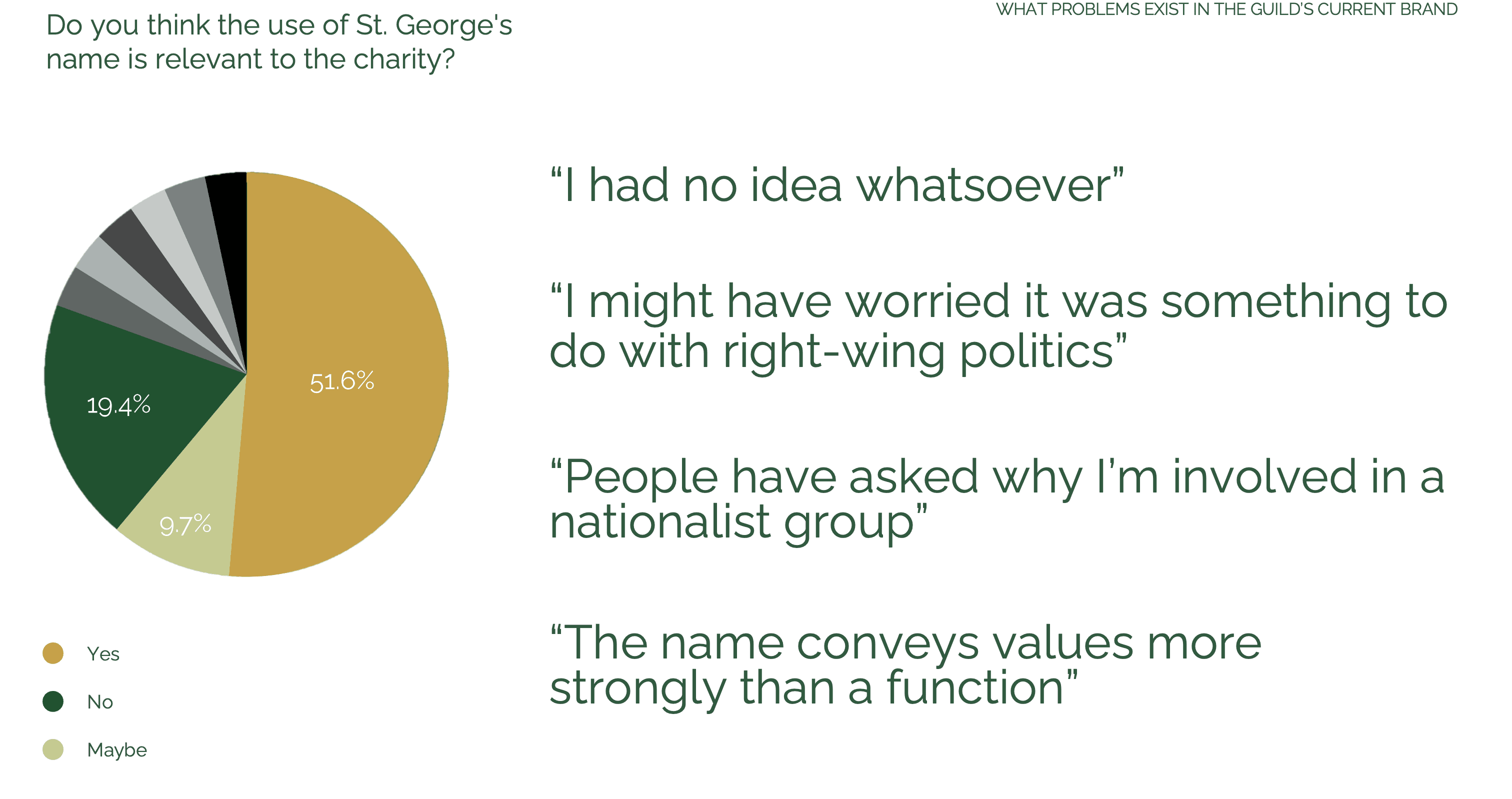
Despite its strong history, the Guild of St. George’s identity struggled to communicate its relevance today. Terms like “Guild” and “Companion” were confusing, and the name, language, and visual identity felt outdated. While the logo is historically significant, it required explanation to be understood. The challenge was to create a brand identity that respects its heritage while positioning it as a contemporary organisation.
Solution
We created a refreshed brand identity positioning the Guild of St. George as a modern, values-led community. A simplified visual system retained subtle heritage references.
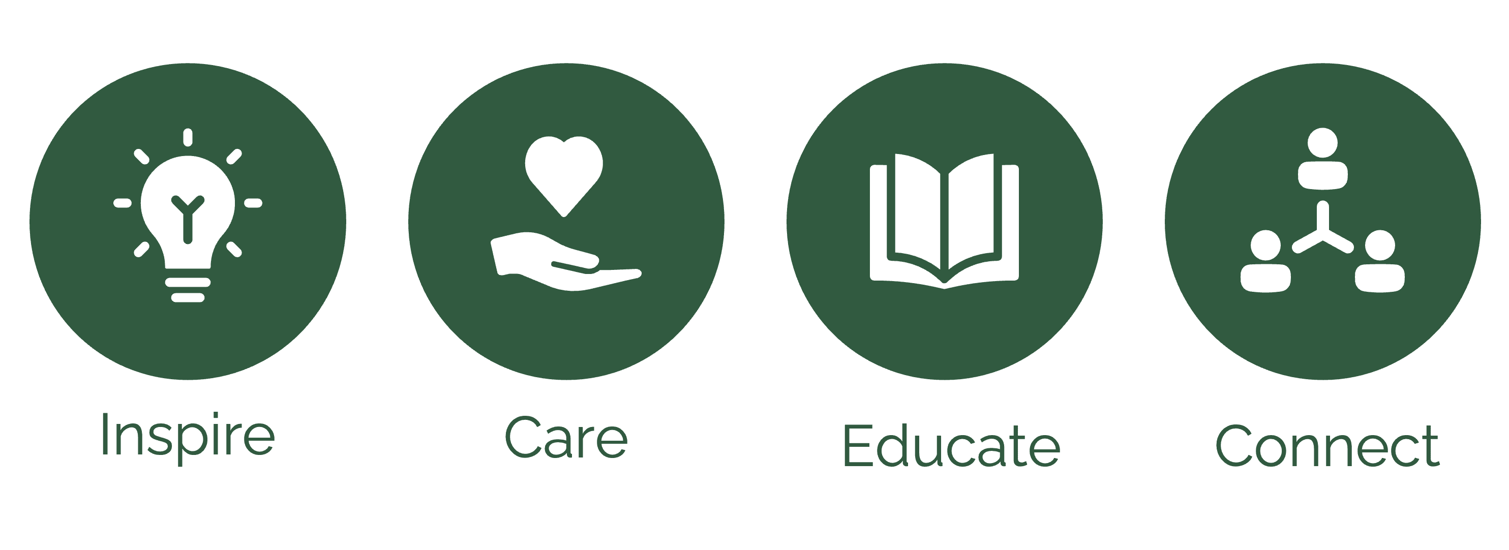
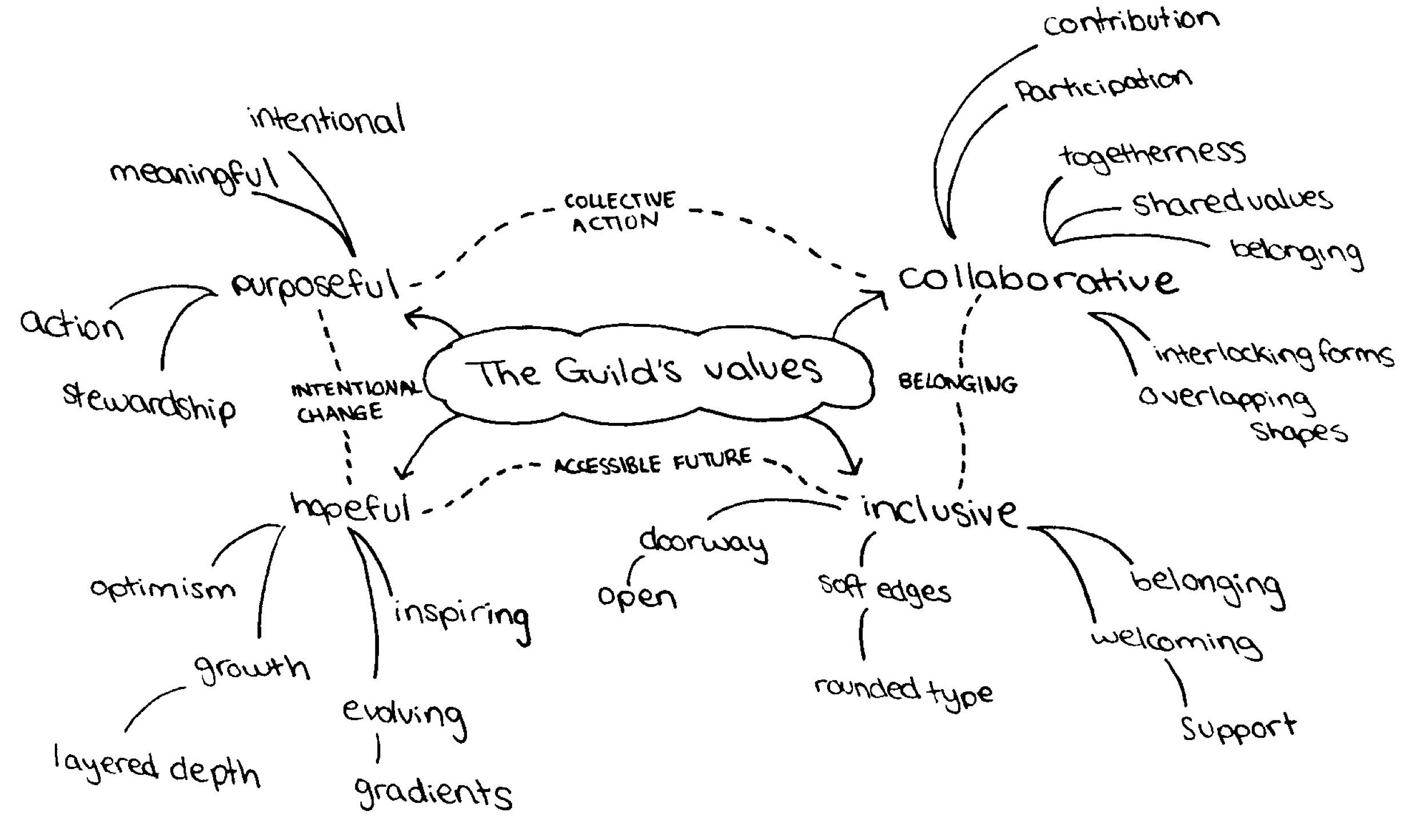
Currently the Guild does not explicitly state their brand values, but these are embedded in their history and language. We developed these values into a core four.
RESEARCH
To find out more about the charity we conducted a short survey for current companions to better understand how the brand is perceived internally.
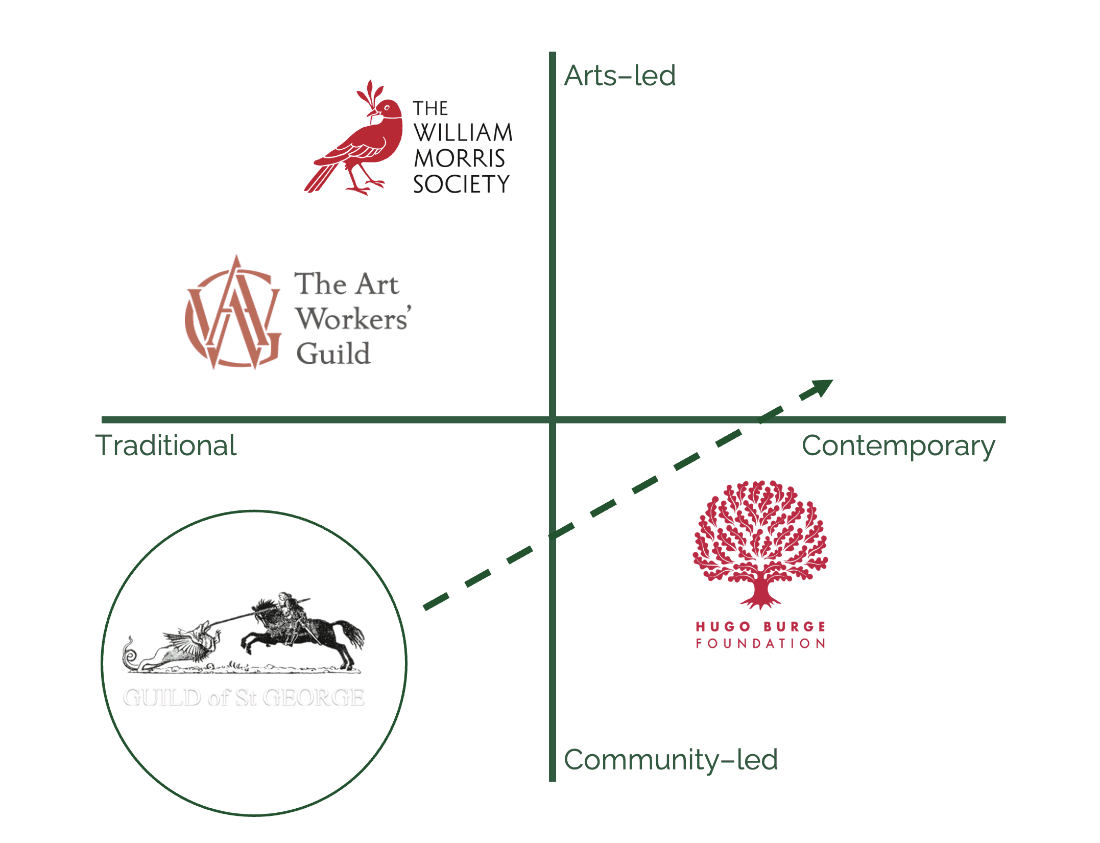
Key comparators included The William Morris Society, The Art Workers’ Guild, and the Hugo Burge Foundation, mapped in a simple grid. This positioned the Guild of St. George as traditional and community-led, with the rebrand aiming to shift it towards a more balanced, contemporary identity bridging arts and community.
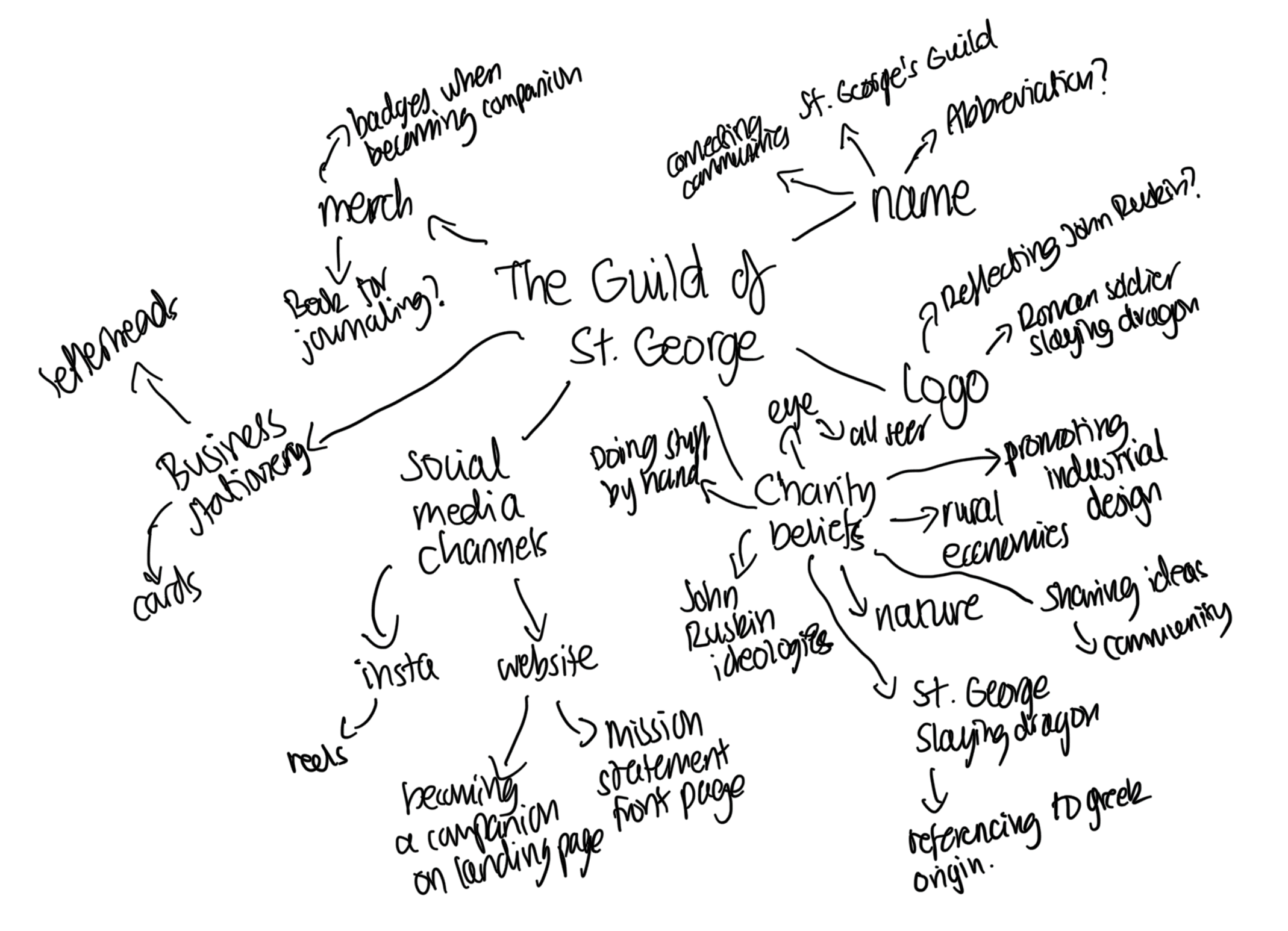
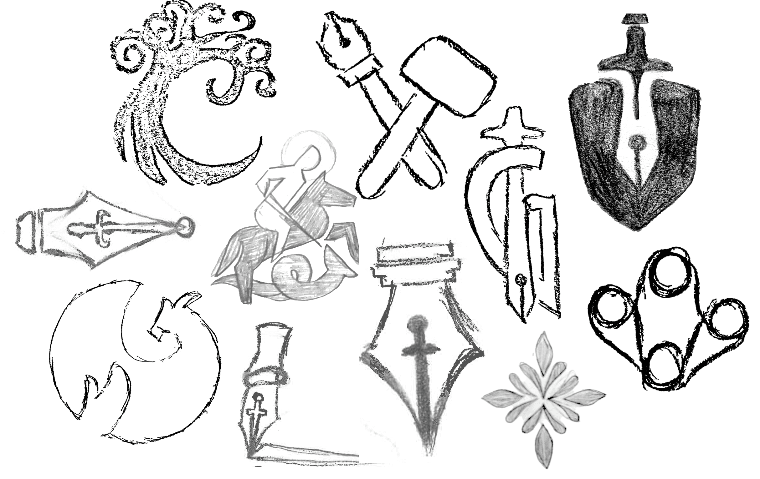
Before getting into any design we created mind maps jotting down ideas onto a page based off everything we already know.
DESIGN
After rounds of sketching we narrowed down to three main directions, the dragon, nature, or a more contemporary route.
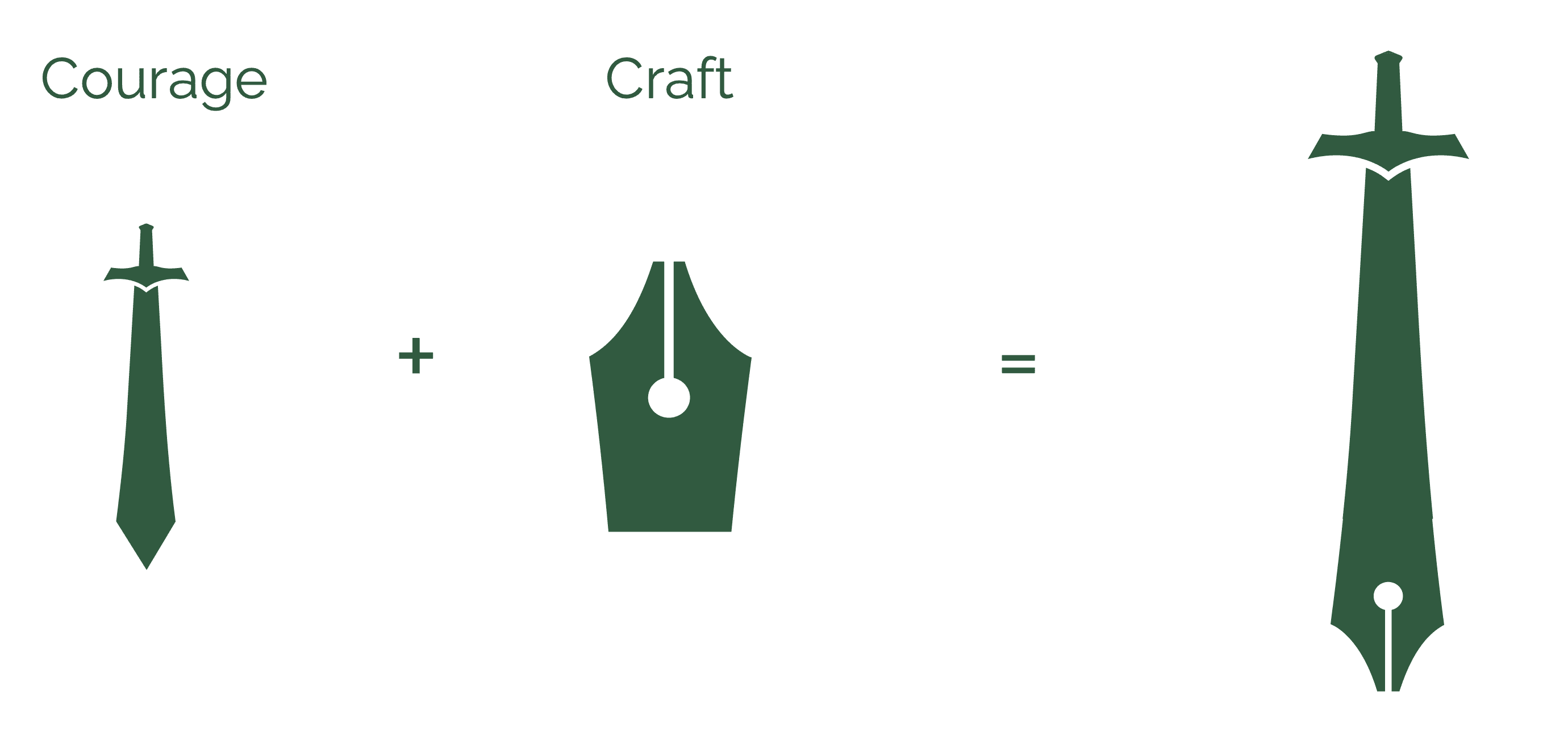
Ideation explored the sword from the current logo, symbolising St George’s courage. This was combined with a pen nib to represent craft and learning, maintaining heritage while better reflecting the Guild’s work.
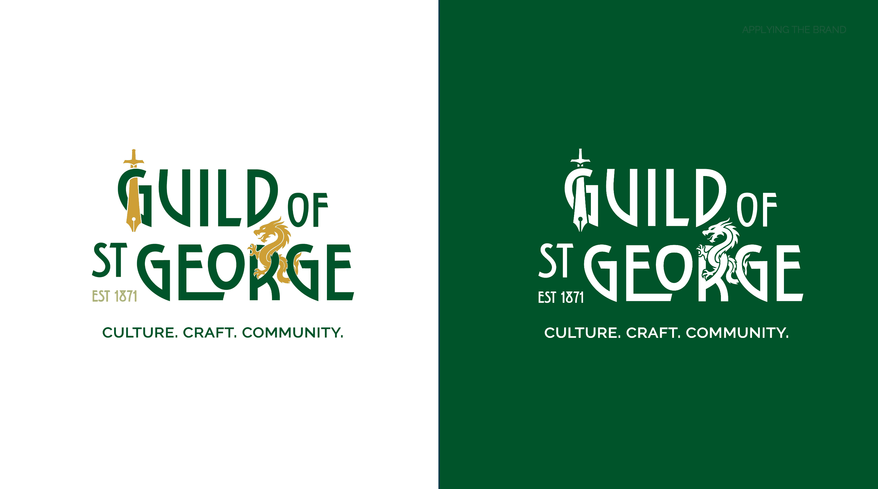
All the assets put together to create our final logo, in both colour and reversed out. With the added strapline to immediately convey the values of the guild. The three c's CULTURE CRAFT AND COMMUNITY.
The brand was applied across the website with a homepage featuring the “three C’s” tagline and Ruskin’s quote “No wealth but life.” It presents the vision, mission, donations, events, and partners clearly.
A highlighted “join” button leads to a page explaining membership, steps to join, and member testimonials to encourage engagement.
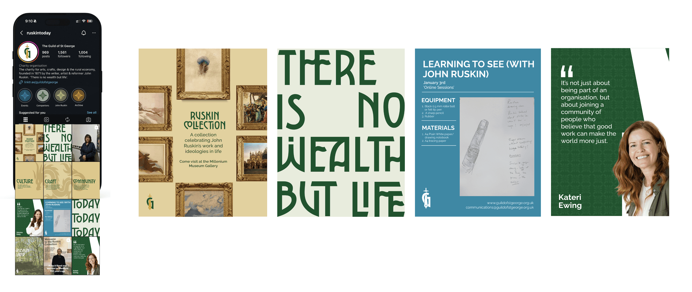
Moving on to social media we incorporated the branded assets used on the website to create consistency across all outputs including the g logomark as the profile picture and our pattern for highlights.
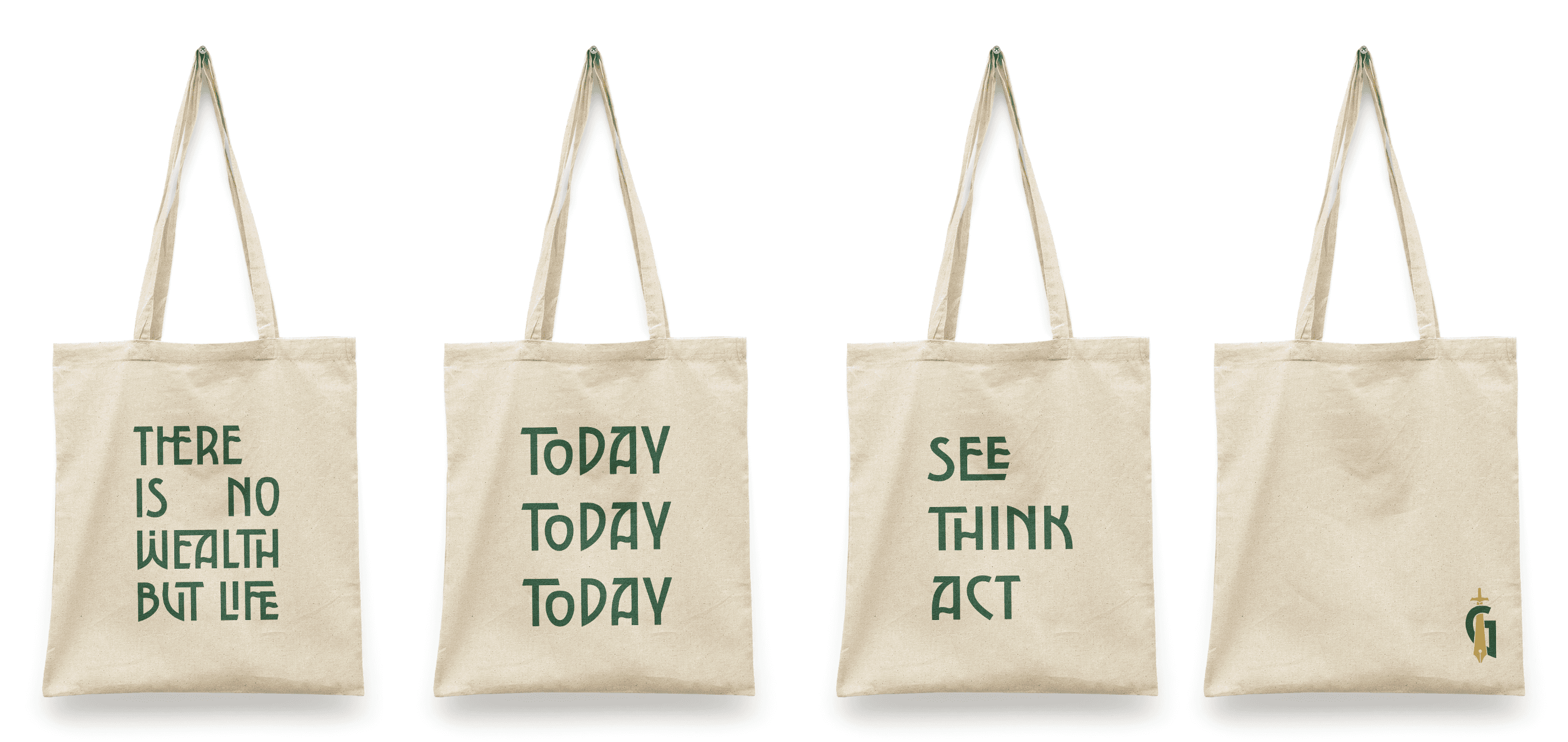
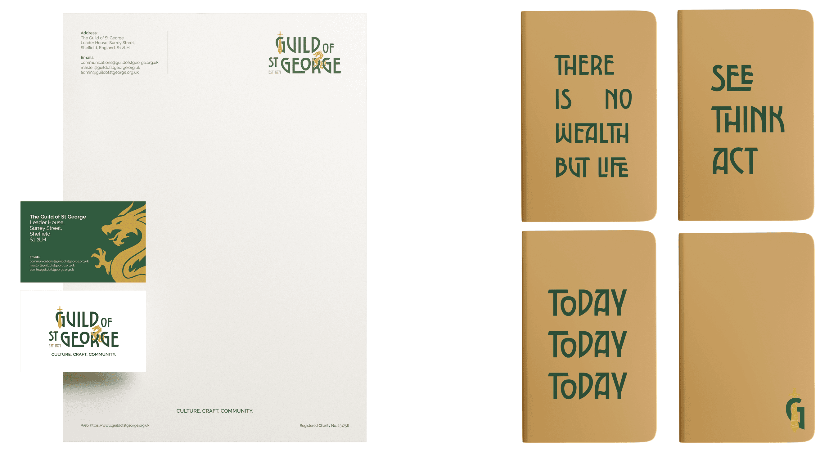
Physical outputs included tote bags with Guild quotes for the Ruskin Collection gift shop, plus stationery items such as letterheads, business cards, and notebooks to extend the identity.